Here are my favorite responsive web design tools sensitive and techniques, it can help web designer to design easy website templates match. These resources have been selected for their ability to help you complete your web designs meet more effective. Initially, a suitable design has been applied to existing screen-centric websites to allow the layout to fit the smaller screen sizes.
Development of technology, particularly devices like smartphones and tablets and more and more control introduces a new concept in web design.
Ethan Marcotte defines Responsive Web Design:
A responsive design is composed of three distinct parts:
- A flexible, grid-based layout
- Flexible images and media, and
- Media queries, a module from the CSS3 specification.
Working on the web, however, is a totally different issue. Our work is defined by its transience, often refined or replaced within a year or two. Window widths inconsistent, screen resolutions, user preferences, and the fonts install our users are just some of the intangibles it negotiate when it publish our work, and over the years, it have become incredibly qualified to do so.
Recently, i have completed design my new website templates (freshdesignweb.com) responsive with screen size solution at the following width ‘breakpoints:’ 320px, 420px, 470px, 600px, 640px, 768px, 960px, 1000px, 1100px, 1250px.
Please kindly find out Responsive Web Design Tools and Techniques bellow:
Responsive Design with CSS3 Media Queries
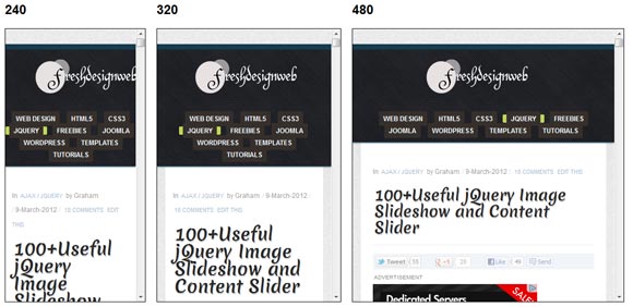
This example tutorial responsive for screen resolution ranges 320px (iPhone) to 2560px (widescreen) or more. Users are no longer just browse the Web with desktops. Users can now use mobile phones, laptops, small tablet devices like the iPad or Playbook to access the Web. Therefore, the traditional fixed width does not work. Web design must be adapted. The layout should be adjusted automatically to fit any screen resolution and peripherals.
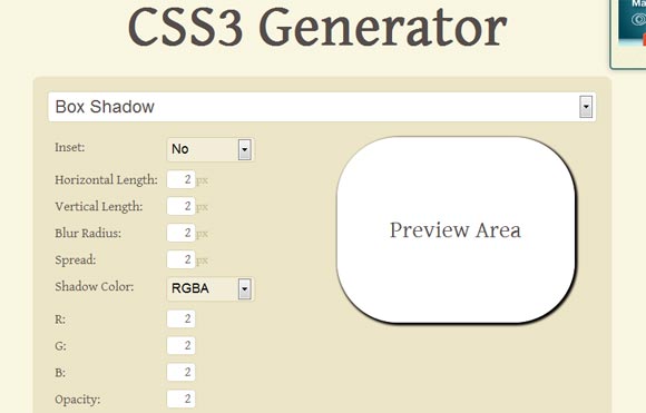
CSS3 Generator Tools Responsive Web Design
CSS3 Generator tools responsive web design which allows you to generate extracts for CSS3 Box Shadow, Text Shadow, Transitions, Transform, Selector, Border Radius and More.
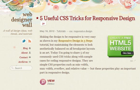
Useful CSS Tricks for Responsive Design
Here are five commonly used CSS tips and case examples for encoding sensitive designs. It are simple as CSS properties min-width, max-width, overflow, and the relative value – but these properties are important in designing reactive.
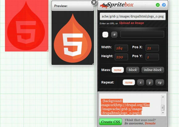
Online Sprite Box Tool Responsive Web Design
Spritebox is a WYSIWYG tool to help responsive web designers quickly and easily create CSS classes and IDs from a single sprite image. It is base on the principle of using the background-position property to align areas of a sprite image into block elements of a web page. It is make using a combination of JQuery, CSS3 and HTML5, and is totally free to use
Pattern Generator Tools Responsive Web Design
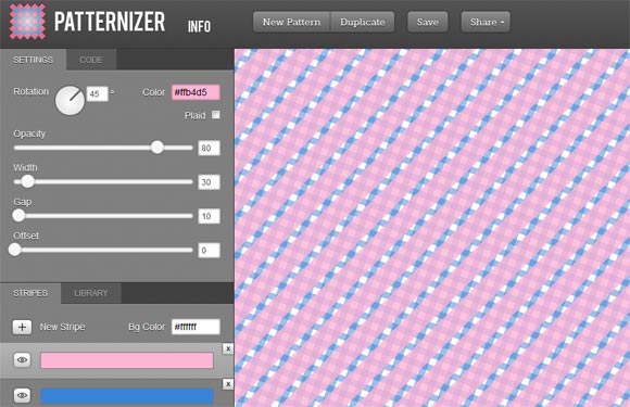
Patternizer is an easy to use the pattern generator for scratching. It’s great fun and free! This flow line tool will be very useful for web designers when it comes to creating overlays and header or backgrounds, same section. I used the power of HTML canvas to give you the model you are looking for in seconds! He has lots of options and it’s really easy to use!
Multi-Device Layout Patterns Responsive Web Design
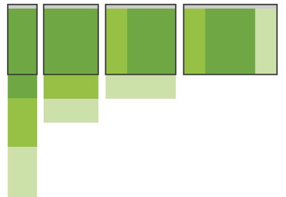
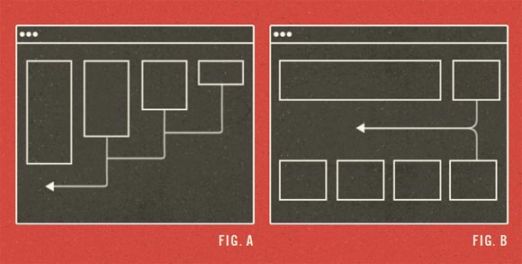
With grids of fluids and adjustments media query, proper design allows Web layouts to suit a variety of screen sizes. More and more designers embrace this technique, it do not just see a lot of innovation, but the emergence of clear trends as well. I cataloged what appears to be the most popular of these models adaptable for multi-device layouts.
Photoshop Grid for Responsive Web Design
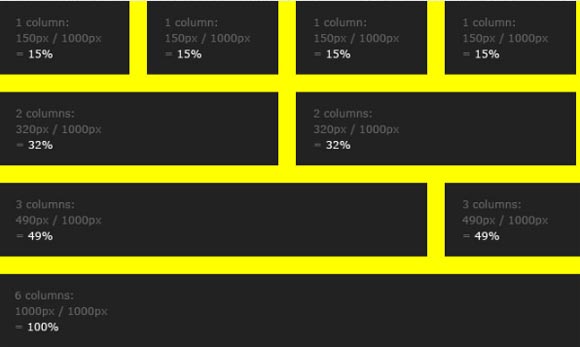
In making the transition to web design sensitive, one of the potential barriers are rather difficult mathematics to calculate percentage based widths needed to put in the fluid. If, for example, you design a 960px grid in Photoshop and you have six columns, each 140px wide, you divide 140 by 960 to get your percentage base on the width: 14.583333%.
Style Tiles Responsive Web Design Examples
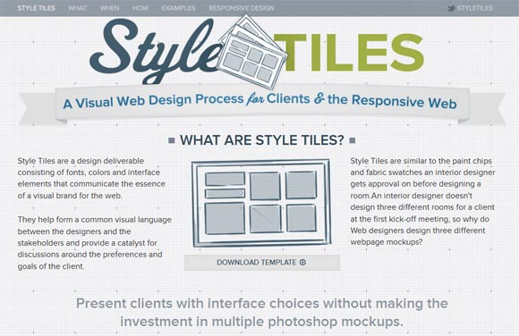
Style tiles are make of a design available fonts, colors and interface elements that communicate the essence of a visual brand for the Web. It help form a common visual language between designers and stakeholders and provide a catalyst for discussions about preferences and client objectives.
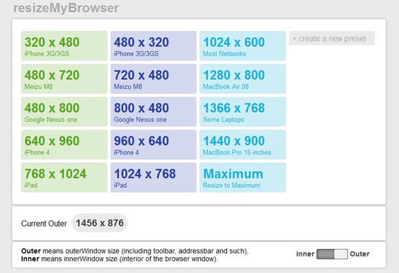
Resize My Browser Tools Responsive Web Design
A simple application browser, useful and beautiful resize the window for designers and Web developers. If you require your browser to display content in a window size sure this is what you were looking for. Just click on the size you need and check what your size is similar. Does not work in Chrome and Opera because of problems with the “resizeTo” event.
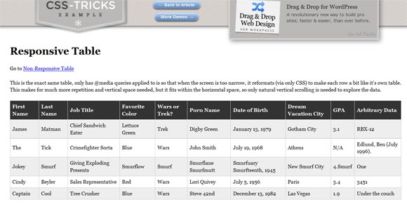
Responsive Table Design Example
This is the exact same table, has only ‘@ media queries is applied so that when the screen is too narrow, it reformats (via CSS only) to make each row a little like his own table. This makes it much repetition and the vertical space needed, but it is part of the horizontal space, so the natural vertical scrolling is necessary to explore the data.
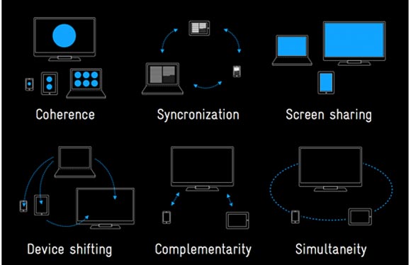
Take a look at this simple but effective slide show to get an idea of the factors that play a basic role in the multi-screen concepts. Work for all these devices is interesting and challenging. Not only because of different screen sizes and input methods, but because it have learned in our user research how different contexts in which these are the gadgets are used.
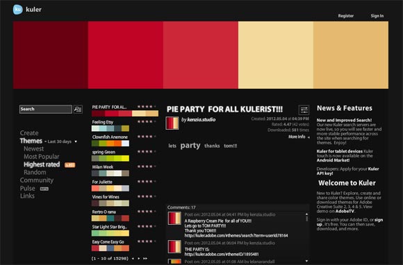
Adobe Kuler – Responsive Web Design Color
Adobe kuler tools for generating color themes that can inspire any project. No matter what you’re creating, with Kuler you can experiment quickly with color variations and browse thousands of themes from the Kuler
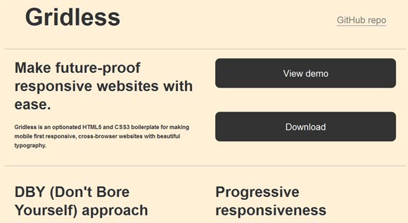
Gridless Future-Proof Responsive Websites
Gridless is a reusable HTML5 and CSS3 optionated for making the first mobile reagents, cross-browser websites with beautiful typography.
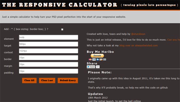
The Responsive Calculator
It comes from a simple calculator to help transform your PSD pixel perfection in the beginning of your website reagent. but this one by Stu Robson goes further than others in generating all the rules of CSS for you, meaning you can simply copy and paste them into your style sheets.
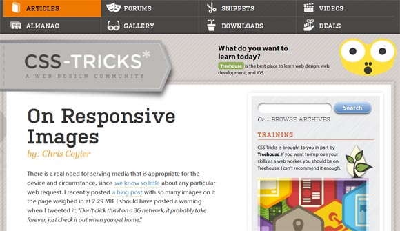
On Responsive Images
Ideally, all these images, I could have used a low-resolution versions of themselves that the display on browsers with smaller sizes of browser windows and / or slower connection speeds. Even in cutting edge browsers, there is no native way to do this yet. This is a good time to start talking about how it want it to work as builders web.
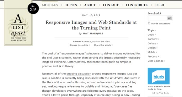
Responsive Images and Web Standards at the Turning Point
The goal of a “response image” solution is to provide optimize images for the context of the end user, rather than serve the larger image potentially necessary for everyone. Unfortunately, this has not been quite so simple in practice as it is in theory.
Seamless Responsive Photo Grid
It is best practice of the images you want to view, and the goal is to get their butt on the browser window without gaps. Just because you think it would be cool. It come in all different sizes.
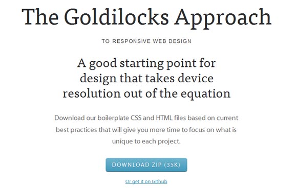
The Goldilocks Approach To Responsive Web Design
A good starting point for design that takes device resolution of the equation. The Goldilocks approach uses a combination of Ems, max-width, media questions and translations of model to consider only three states that allow your designs to be resolution independent.
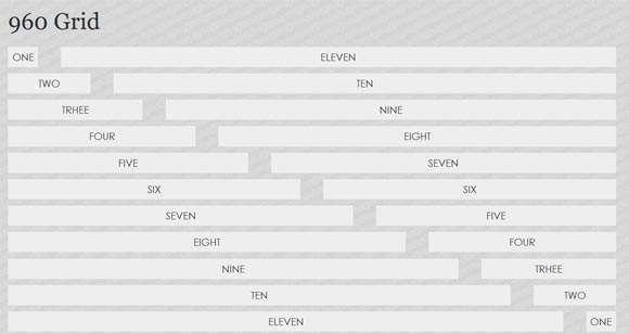
960 Grid: Responsive Website Example
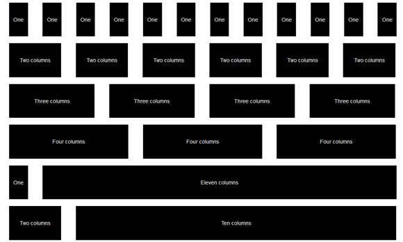
Grid 960 is what you expect the most modern websites to follow as his establishment of a maximum width of 960px that match the screen resolution of 1024×768 the most common.
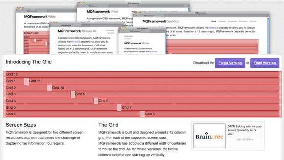
MQFramework Responsive Web Design
A CSS framework sensitive, MQFramework uses @ media ownership to allow you to design your sites for sailors of all sizes. Based on a grid of 12 columns, MQFramework degrades completely down for mobile screen sizes.
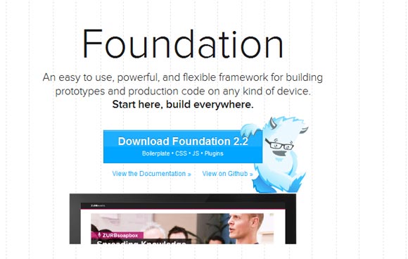
Foundation Responsive Web Design
Foundation is done by ZURB, an interaction design and strategy firm located in Campbell, California. It have over 10 years of building products experience Web services and Web sites in this part. Foundation is an easy to use, powerful, and flexible framework for prototyping and production code on any device..
BluCSS – CSS framework Responsive Web Design
BluCSS is a CSS framework design with ease of use and simplicity in mind. It is specially design so that when you work on your next project, you do not have to worry about most. With BluCSS, you can operational in less than a minute.
Grid 1140 Responsive Web Design Examples
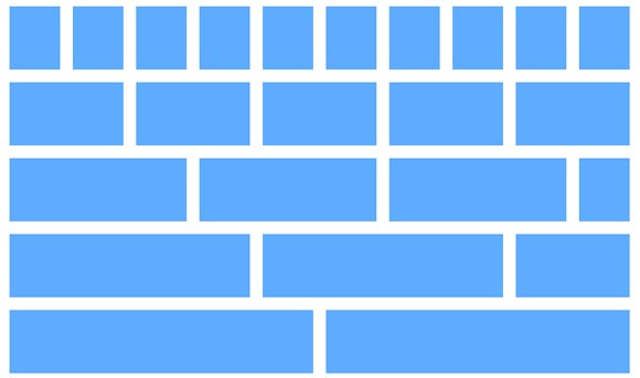
Grid 1140 fits perfectly into a monitor 1280. On small screens it becomes fluid and adapts to the browser width. Beyond a certain point, it uses queries media to serve a mobile version, which essentially stacks all the columns on top of each other so that the flow of information still makes sense.
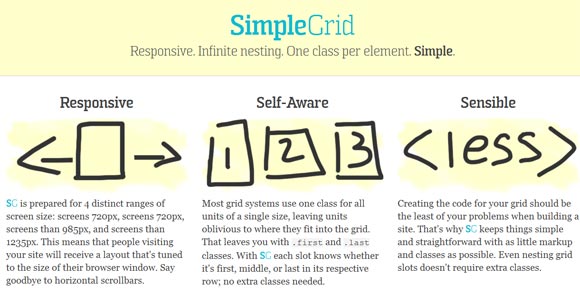
SimpleGrid Responsive Web Design
This framework CSS allows you to design sites compatible with different devices and screen size.
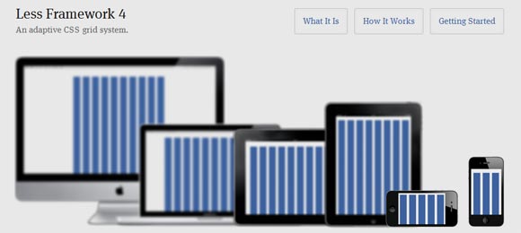
Less Framework 4
Less Framework is a grid system for CSS website design adaptive. It contains four models and three sets of presets typography, all base on one rack.
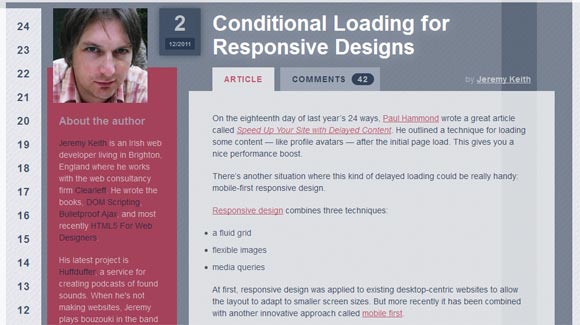
Conditional Loading for Responsive Designs
There is another situation where this kind of lazy loading could be really practical: mobile-first conception.
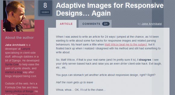
Adaptive Images for Responsive Designs
New Techniques Adaptive Images for Responsive Designs
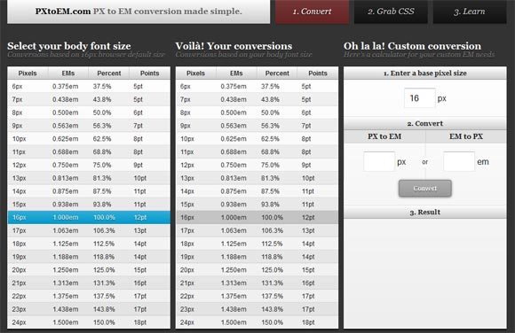
Tool for Responsive Typography
Here PXtoEM.com The site provides a calculator to convert practice type measures, from the pixels in the EMS. Voila! Your type is ready to stretch and adapt whatever proportions the browser needs to make while preserving the spatial relationships elegant you so laboriously developed.
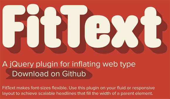
FitText – jQuery Plugin for Inflating Web Type
FitText-made sizes are flexible. Use this plugin on your layout fluid or reagent to achieve scalable headlines that fill the width of a parent element. Oh, and do not you dare to catch up are you using on the text of paragraph FitText. This is huge for the text only!
Modernizr
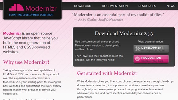
Modernizr Modernizr is an open-source JavaScript library that helps you build the next generation of HTML5 and CSS3-powered sites. Modernizr gives you finer control of the experience by detecting JavaScript oriented, it is important to continue to use best practices throughout your development process. Use progressive enhancement where you can, and do not sacrifice accessibility for convenience or performance.
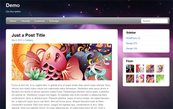
Responsive WordPress Themes
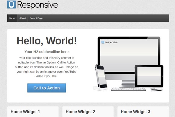
Sensitive WordPress theme that has 9 page templates as a blog, Blog Summary drawings and models for layout-based: sidebar / content, sidebar / half content, content / sidebar and content / sidebar half. There is also the full page width, model sitemap and the landing page for your PPC or any other purpose.
Tiny Fluid Grid Responsive Web Design Tools
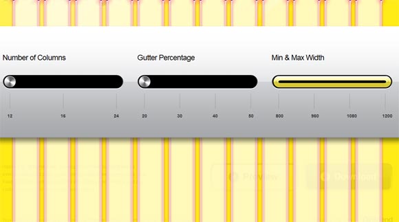
Tiny fluid grid is a web-based genius who can help you determine the grid system of your design. By adjusting the number of columns, the percentage of gutter minimum and maximum widths of your design, the application can give you a download of your CSS grid sensitive.
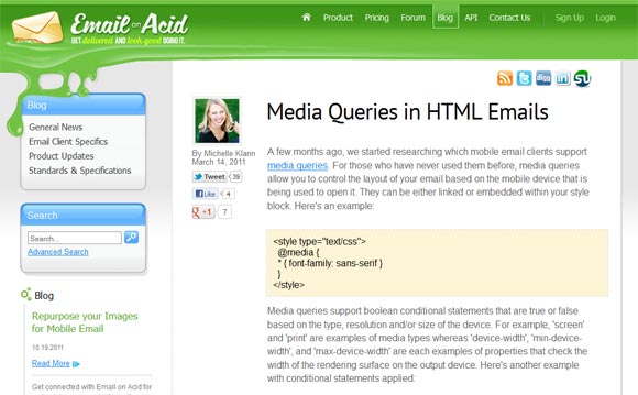
Media Queries in HTML Emails Responsive Web Design
This article covers the use of media requests to target mobile email clients.
Responsive Web Design Testing Tool
This tool is for everyone who needs a quick and easy way to test their web design in screen widths. Modify the variable DefaultUrl early responsive.js file to your own website and navigate your website within frames.
Concept Choreograph Responsive Web Design
The concept of permanence to place content on a web page for a single navigation width or resolution is becoming a thing of the past. Media-examined in adaptive response sites and it offer the opportunity to re-architect the content of a page base on its container, but with this potential new challenge came just as exciting.
More Responsive Design, Please
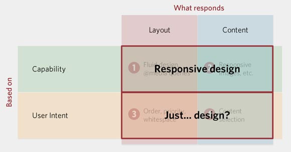
Ethan, the guy that started the madness, defines a suitable design in part by @ media queries, I think it count as necessary, but perhaps not sufficient. A suitable design is all about how it build a site to respond to information.
Responsive Images: Experimenting with Context-Aware Image Sizing
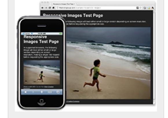
In supported browsers, the following image will load version is small or large, depending on screen resolution, a single application 1kb before applying the appropriate size.
Fluid Images Responsive Web Design Techniques
Smooth images are a central aspect of a reactive design. This article by Ethan Marcotte gives a comprehensive overview on creating using classical img {max-width: 100%;} code snippet, and details to get you started.
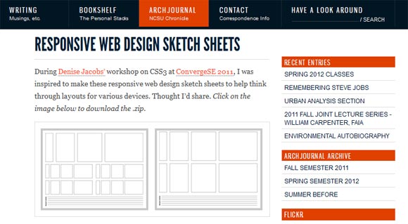
Responsive Web Design Sketch Sheets
It is inspired to make these sensitive web design sketch sheets to help reflect provisions for various devices. This tool is a useful aid in mapping the development of elements through various devices. With this tool, you can get an idea where to place the elements of the web page in different sizes of browsers.
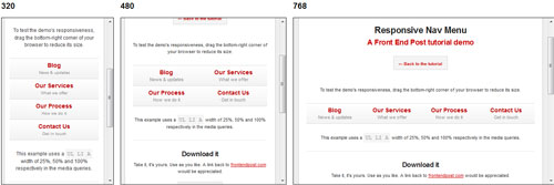
Techniques Create a Responsive Nav Menu
Here’s a quick tutorial for the reactivity of main navigation menu using that learning to show how easy it is. with just a dip of media inquiries.
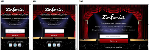
How to Create a Responsive HTML5 Signup Page
This tutorial is base on HTML5 (mat, to be precise) and CSS3 if you view this on older versions of Internet Explorer (and I assume you use IE or because you do not have a choice whether or you are some kind of masochist), then you will miss many of the design features. Yes, the service promoted in the demo is false.
Responsive Web Design: Layouts and Media Queries
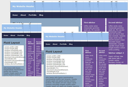
Fluid layout is base on a system of relative units rather than absolute pixel. This type of layout has been around for a while now, and most designers use grids create in fluids percentage points to these provisions.
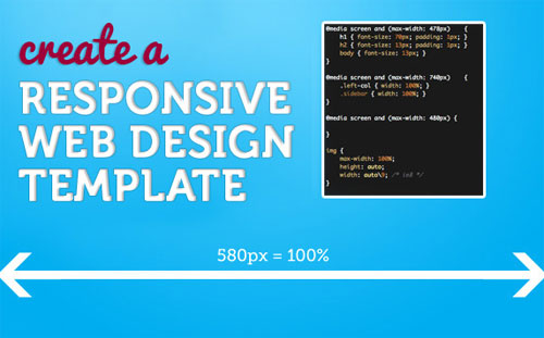
Create a Responsive Web Design Template
In this tutorial, it will teach you how to make a web model (simple looking) which is sensitive from the desktop size down to a mobile version.
Responsive images using CSS3
CSS future implementations should allow some form of sensory images via CSS alone. It is an idea at the beginning of how this could be done. However, a significant drawback is that it would not prevent both “mobile optimized” and larger images to be applied to larger screen resolutions.






thanks for sharing easily method on how to create a responsive page design.
Thanks for sharing these useful web design tools with us.
It’s Too Good.Thanks for share this.It saves my lot of time.
So thanks again 🙂
Thank You on providing good responsive web design information for us.
Test your site in various devices from an iPhone and iPad, to a Kindle and on Android on the Responsivetools. It also shows your site both in portrait and landscape mode. I like this tool much more because of the outlines of the devices displayed on the page, which brings more meaning to the whole process.
Great post. I was checking continuously this blog and I’m inspired. A nice choice of responsive webdesign samples and helpful resources.
[…] this cool photoshop effects tutorials you will learn advanced techniques of design to create an exciting photo effect and learn to take care of many details. It is made of the […]
awesome collection of information …. thanks for sharing this post it will help new web designer include me . thanks again
A nice selection of responsive webdesign samples and useful resources. The Less Framework is a really great tool to design beautiful websites.
Thanks a lot for these posts.. Going to help a lot for my coming designs and website..!! Thanks once again, Graham..!! 🙂
That was a really good article about Webdesigning. Thanks and keep posting. Love, Naroth
Great list of tools! Some in their I have not tested out, looking forward to trying them.
Very interesting.
I didn´t know that the responsibe could go so far XD
Nice list, I think I was missing a detailed guide for responsive design tools lately!
Could I please recommend some of Vladimir Carrer’s tools here:
http://www.vcarrer.com/
They include wireframing kits, Emastic http://code.google.com/p/emastic/ an expanding grid system with em and % measures, and the other Golden Grid http://code.google.com/p/the-golden-grid/ .
Also there’s a very useful grid system generator here: http://www.gridsystemgenerator.com/gs02.php
i am finding responsive slider and responsive videos…. thank you..
I like responsive data table roundup. Thank Graham for sharing 😀
Really useful tools for web designer… Thank for sharing 😀
Hello Graham,
Thank you for this interesting post on responsive web design. Responsive pages are being used a lot more now, especially with mobiles being used more and more to browse the internet. This post is very useful and more so in the future when I come to do mobile websites. I have bookmarked a few of these pages for future reference. Thank you again.