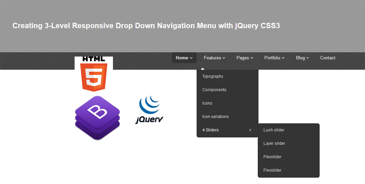
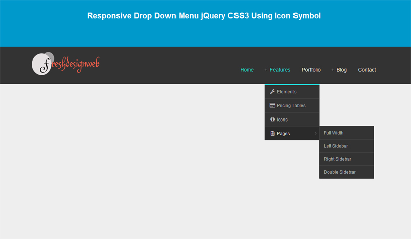
In this tutorial, we’ll create a beautiful drop drown responsive menu with new feature of css3 (media queries) and jQuery library to enhance the design and layout of a website navigation menu to fit different screen sizes. It have design to change the layout from big computer screens to smaller screens mobile support, to make it responsive displa.
 Demo Download
In my previous post, you may also see a simple responsive menu(jQuery mobile style) by using CSS3 style. In this article, you will know more how design a responsive drop down menu using CSS3 and jQuery.
This navigation menu we’ll be using the following plugins:
Let’s start with the HTML
The Markup
The HTML will be built up viewport meta tag to control layout on mobile browsers
A typical mobile-optimized site contains something like the following:
<head>
<meta name="viewport" content="width=device-width, initial-scale=1, maximum-scale=1.0, user-scalable=no"/>
</head>
The CSS and JavaScript Link have the following code:
<link rel="stylesheet" type="text/css" href="styles.css" media="all" />
<script src="js/jquery-1.7.2.min.js"></script>
The JavaScript to build select nav for mobile and show and hide sub menu will have the following code:
<!--  javaScript -->
<script>
<!--  // building select nav for mobile width only -->
$(function(){
	// building select menu
	$('<select />').appendTo('nav');

	// building an option for select menu
	$('<option />', {
		'selected': 'selected',
		'value' : '',
		'text': 'Choise Page...'
	}).appendTo('nav select');

	$('nav ul li a').each(function(){
		var target = $(this);

		$('<option />', {
			'value' : target.attr('href'),
			'text': target.text()
		}).appendTo('nav select');

	});

	// on clicking on link
	$('nav select').on('change',function(){
		window.location = $(this).find('option:selected').val();
	});
});

// show and hide sub menu
$(function(){
	$('nav ul li').hover(
		function () {
			//show its submenu
			$('ul', this).slideDown(150);
		},
		function () {
			//hide its submenu
			$('ul', this).slideUp(150);
		}
	);
});
//end
</script>
<!-- end -->
The drop down menu will have the following structure:
<div id="fdw">
				<!--nav-->
					<nav>
						<ul>
							<li class="current"><a href="https://www.freshdesignweb.com">home<span class="arrow"></span></a>
								<ul style="display: none;" class="sub_menu">
									<li class="arrow_top"></li>
									<li><a class="subCurrent" href="https://www.freshdesignweb.com">Home Service</a></li>
									<li><a href="https://www.freshdesignweb.com">Home Responsive</a></li>
								</ul>
							</li>
							<li><a href="https://www.freshdesignweb.com">about</a></li>
							<li><a href="https://www.freshdesignweb.com">services</a></li>
							<li>
								<a href="https://www.freshdesignweb.com">portfolio<span class="arrow"></span></a>
								<ul style="display: none;" class="sub_menu">
									<li class="arrow_top"></li>
									<li><a href="https://www.freshdesignweb.com">Portfolio 3 </a></li>
									<li><a href="https://www.freshdesignweb.com">Portfolio 4 </a></li>
									<li><a href="https://www.freshdesignweb.com">Portfolio Single</a></li>
									<li><a href="https://www.freshdesignweb.com">Portfolio Two</a></li>
								</ul>
							</li>
							<li>
								<a href="https://www.freshdesignweb.com">blog<span class="arrow"></span></a>
								<ul style="display: none;" class="sub_menu">
									<li class="arrow_top"></li>
									<li><a href="https://www.freshdesignweb.com">Design</a></li>
									<li><a href="https://www.freshdesignweb.com/category/html5/">HTML5</a></li>
									<li><a href="https://www.freshdesignweb.com/category/css-html">CSS3</a>
									</li><li><a href="https://www.freshdesignweb.com/category/ajax-jquery">jQuery</a></li>
								</ul>
							</li>
							<li><a href="https://www.freshdesignweb.com">contact</a></li>
						</ul>
					</nav>
		</div><!-- end fdw -->
The Cascading Style Sheets (CSS)
/*===== nav style ======*/
#fdw nav select {
	display:none; /* this is just for the mobile display */
}
#fdw nav ul {
	display:block;
	z-index:999999;
}
#fdw nav ul li {
	display:inline-block;
	padding:50px 3px 30px;
	margin-left:30px;
	position:relative;
}
#fdw nav ul li a:link, #fdw nav ul li a:visited {
	color:#444;
	font:normal 20px 'Yanone Kaffeesatz', sans-serif;
	text-transform:uppercase;
	display:inline-block;
	position:relative;
}
#fdw nav ul li a:hover, #fdw nav ul li a:active {
	color:#e25d29;
	text-decoration:none;
}
#fdw nav ul li span {
	position:absolute;
	right:-12px;
	bottom:6px;
	width:7px;
	height:8px;
	margin:0 0 0 3px;
	float:right;
	display:block;
	background:url('images/nav_arrow.png') no-repeat left -8px;
	font:0/0 a;
}
#fdw nav ul li.current {
	border-bottom:2px solid #e25d29;
}
#fdw nav ul li.current a {
	color:#e25d29;
	cursor: default;
}
#fdw nav ul li.current a span {
	background:url('../images/nav_arrow.png') no-repeat left 0;
}
#fdw nav ul li.current ul li a {
	cursor:pointer;
}

/*===== sub_menu Style =======*/
#fdw nav ul li ul.sub_menu {
	position:absolute;
	top:90px;
	left:0;
	margin:0;
	padding:0;
	background:#fff;
	border:1px solid #ececec;
	border-top:5px solid #e25d29;
	display:none;
	z-index:999999;
    -moz-box-shadow: 0px 6px 7px #121012;
    -webkit-box-shadow: 0px 6px 7px #121012;
    box-shadow: 0px 6px 7px #121012;
}
#fdw nav ul li ul.sub_menu li.arrow_top {
	position:absolute;
	top:-12px;
	left:12px;
	width:13px;
	height:8px;
	display:block;
	border:none;
	background:url('images/arrow_top.png') no-repeat left top;
}
#fdw nav ul li ul.sub_menu li {
	float:none;
	margin:0;
	padding:0;
	border-bottom:1px solid #ececec;
}
#fdw nav ul li ul.sub_menu li a {
	white-space: nowrap;
	width: 150px;
	padding:12px;
	font:13px Arial, tahoma, sans-serif;
	text-transform:capitalize;
	color:#777;
}
#fdw nav ul li ul.sub_menu li a:hover {
	background:#f9f9f9;
	color:#333;
}
#fdw nav ul li ul.sub_menu li a.subCurrent {
	color:#e25d29;
	cursor:default;
}
#fdw nav ul li ul.sub_menu li a.subCurrent:hover {
	background:none;
}
The media queries css will have the following code:
@media only screen and (min-width: 768px) and (max-width: 959px) {
		/* nav */
		#fdw nav ul li{
			margin-left:12px;
		}
}

	/* All Mobile Sizes (devices and browser) */
@media only screen and (max-width: 767px) {

		/* nav menu ul & select */
		#fdw nav ul {
			display:none;
		}
		#fdw nav select {
			width:100%;
			display:block;
			margin-bottom:30px;
			cursor:pointer;
			padding:6px;
			background:#f9f9f9;
			border:1px solid #e3e3e3;
			color:#777;
		}
}
Now! It have a Drop-Drown responsive navigation menu with jQuery and CSS3. Check out the demo below, and feel free to download this example for future use. I hope you enjoyed this tutorial and find it useful!

Hey Dude!
Thanks for the code though this is not really a tutorial (which EXPLAINS things) but a good code-example.
Great job! Is it possible to make this menu float right ?