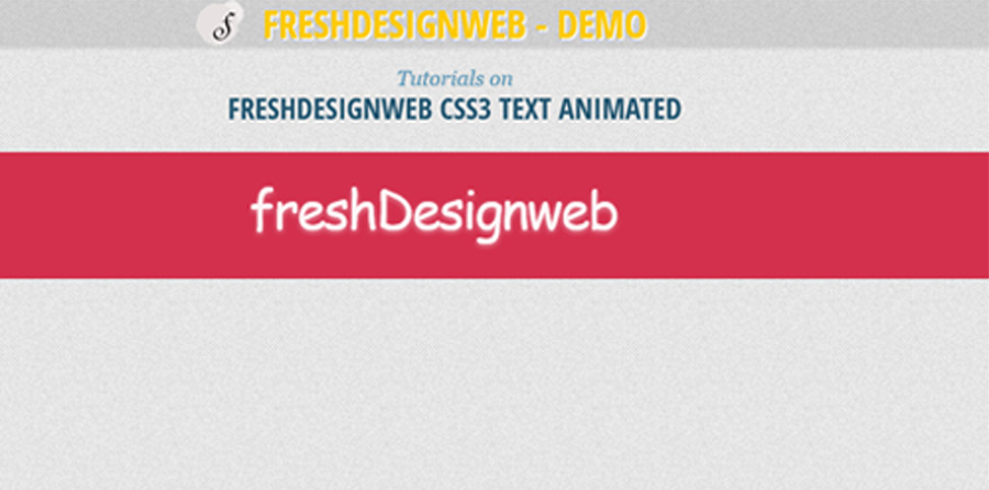
A tutorial that shows you how to create css3 text hover effect seen on the website. Using transforms, transitions and animations, the aim is to use smooth effect on text style. It seem like flash animation effects but it used only css3 style.

Today it would like to show how to create the useful text animated. If you haven’t seen the website, you should definitely go and check it out; it is full of interesting and creative effects. This example really nice effect which it will re-implement today using transforms, transitions and animations.
Please note that this will only work properly in modern browsers that support the CSS3 properties in use.
The Cascading Style Sheets (CSS) will have the following structure:
.bg_text{
background-color: #D3304D;
width:100%;
}
.Out {
	opacity: 0;
	transform: scaleY(0);
}
.In {
	opacity: 1;
	transform: scaleY(1);
}
.main {
	position: relative;
}
.desc {
	position: relative;
	z-index: 100;
	border-top:1px dotted #cccccc;
	margin-top:40px;
}

.textAnimated {
	width: auto;
	margin: 0px auto;
	cursor: default;
	animation: fadeIn 0.6s ease-in-out 2s;
	animation-fill-mode: forwards;
}
.textAnimated > span {
	display: block;
	-webkit-backface-visibility: hidden;
}
.textAnimated-cut {
	width: 100%;
	height: 60px;
	overflow: hidden;
	-webkit-transition: all 0.6s ease-in-out;
	-moz-transition: all 0.6s ease-in-out;
	-o-transition: all 0.6s ease-in-out;
	-ms-transition: all 0.6s ease-in-out;
	transition: all 0.6s ease-in-out;
}

.textAnimated-cut span {
	display: block;
	line-height: 120px;
	color: rgba(255,255,255,0.9);
	font-size: 50px;
	margin-top: 6px;
	letter-spacing: -2px;
	font-family: 'Days One', cursive;
	text-shadow: 0px 2px 4px rgba(255,255,255,0.5);
}
.textAnimated-cut:last-child span {
	margin-top: -54px;
}
.textAnimated-mid {
	font-family: 'Days One', cursive;
	font-size: 30px;
	letter-spacing: 3px;
	line-height: 40px;
	text-indent: 20px;
	position: absolute;
	top: 50%;
	margin-top: -20px;
	width: auto;
	color: rgba(255,255,255,0.5);
	opacity: 0;
	-webkit-transform: scale(0.3);
	-moz-transform: scale(0.3);
	-o-transform: scale(0.3);
	-ms-transform: scale(0.3);
	transform: scale(0.3);
	-webkit-transition: all 0.6s ease-in-out 0s;
	-moz-transition: all 0.6s ease-in-out 0s;
	-o-transition: all 0.6s ease-in-out 0s;
	-ms-transition: all 0.6s ease-in-out 0s;
	transition: all 0.6s ease-in-out 0s;
}
.textAnimated:hover .textAnimated-cut:first-child {
	-webkit-transform: translateY(-40px);
	-moz-transform: translateY(-40px);
	-o-transform: translateY(-40px);
	-ms-transform: translateY(-40px);
	transform: translateY(-40px);
	opacity: 0;
}
.textAnimated:hover .textAnimated-cut:last-child {
	-webkit-transform: translateY(40px);
	-moz-transform: translateY(40px);
	-o-transform: translateY(40px);
	-ms-transform: translateY(40px);
	transform: translateY(40px);
	opacity: 0;
}
.textAnimated:hover .textAnimated-mid {
	-webkit-transition-delay: 0.6s;
	-moz-transition-delay: 0.6s;
	-o-transition-delay: 0.6s;
	-ms-transition-delay: 0.6s;
	transition-delay: 0.6s;
	opacity: 1;
	-webkit-transform: scale(1);
	-moz-transform: scale(1);
	-o-transform: scale(1);
	-ms-transform: scale(1);
	transform: scale(1);
}
Now! It have a nice CSS3 text hover effects . Check out the demo below, and feel free to download this example for future use. I hope you enjoyed this tutorial and find it useful!

VERY NICE