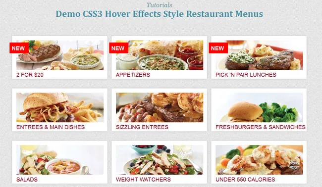
CSS3 Hover Effects Style Restaurant Menus
This time I will show you CSS3 hover effects using CSS properties, this sample design you use for purpose restaurant website, foods or product and more. In this tutorial, it only use CSS transition and box shadow style to create beautiful image style with show and hidden text. In fact now it can use more properties of CSS to create style effects in stead of jQuery hover effects.

Also read: 54 Beautiful HTML CSS Button Style, 33 Best HTML5 and CSS3 3D Demo Examples, 116 Useful CSS3 Tutorials Examples and Tricks for Designer
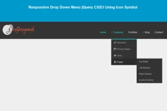
This image menu style it have design to fix the layout support from big screens to smaller screens, to make it responsive display.
Please note that this will only work properly in modern browsers that support the CSS3 properties in use.
Now! It have a beautiful CSS3 Hover Effects Style Restaurant Menus. Check out the demo below, and feel free to download this example for future use. I hope you enjoyed this tutorial and find it useful!


All over really awesome hover effect, with out using javascript or jquery. But if you see on the 3rd row on mouse hover we have to scroll to view the content of that menu. And will be more awesome if you add some jquery scroll effect on 3rd rows menus..
Anyway but everything is really cool and awesome.
cheers 😉