
Fashion Responsive Slider Tutorial
In this tutorial, we’ll create a responsive slider with new feature of css3 (media queries) to alter the design and layout of a website slider to fit different screen sizes. It have design to change the layout from large screens to smaller screens support, making it responsive display.

Responsive design is the best way to fix screen solution problem, In this tutorial, we’ll focus on design of the user experience image slider to make it run better both on computer and mobile devices.
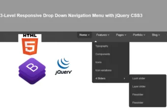
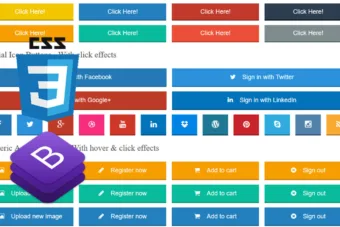
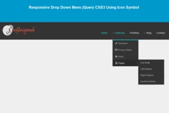
Also read: 54 Beautiful HTML CSS Button Style, 116 Useful CSS3 Tutorials Examples and Tricks for Designer, Free Responsive Drop Down Menu jQuery CSS3 Using Icon Symbol
In this slider, it have design to response layout width small than 1000px, it will display slider in smart phone version and layout width bigger than 1000px, it will display menu on computer version.
This slider we’ll be using the following jQuery plugins:
–FlexSlider markup is simple and straightforward
Let’s start with the HTML
The Cascading Style Sheets (CSS)
The fashion slider css will have the following code:
.slider_container{ width:920px; margin:auto; clear:both; background:url(images/shadow_top.png) no-repeat top center; padding:30px 0 0 0;}
.flex-caption{ position: absolute; right:11px; bottom:20px;}
.caption_title_line{ width:450px; height:75px; padding:5px 15px 10px 15px;background:url(images/slider_caption_bg.png) repeat;color: #303030;}
.flex-caption h2{ color:#303030;font-size:20px; padding:5px 0 5px 0; margin:0px;font-family: 'Ovo', serif;}

.flex-container a:active,
.flexslider a:active {outline: none;}
.slides,
.flex-control-nav,
.flex-direction-nav {margin: 0; padding: 0; list-style: none;}

/* FlexSlider Necessary Styles
*********************************/
.flexslider {width: 100%; margin: 0; padding: 0 0 30px 0;background:url(images/shadow_bottom.png) no-repeat center bottom;}
.flexslider .slides > li {display: none;} /* Hide the slides before the JS is loaded. Avoids image jumping */
.flexslider .slides img {max-width: 100%; display: block; border:10px #ededed solid;}
.flex-pauseplay span {text-transform: capitalize;}
.slides:after {content: "."; display: block; clear: both; visibility: hidden; line-height: 0; height: 0;}
html[xmlns] .slides {display: block;}
* html .slides {height: 1%;}
.no-js .slides > li:first-child {display: block;}
.flexslider {position: relative; zoom: 1;}
.flexslider .slides {zoom: 1;}
.flexslider .slides > li {position: relative;}
.flex-container {zoom: 1; position: relative;}

/* Direction Nav */
.flex-direction-nav li a {width:45px; height:42px; margin:0; display: block; position: absolute; right:11px; cursor: pointer; text-indent: -9999px;}
.flex-direction-nav li a.next {background:url(images/next.png) no-repeat center; bottom:184px;}
.flex-direction-nav li a.prev {background:url(images/prev.png) no-repeat center;bottom:141px;}
.flex-direction-nav li a.next:hover {background:url(images/next_a.png) no-repeat center;}
.flex-direction-nav li a.prev:hover {background:url(images/prev_a.png) no-repeat center;}
.flex-direction-nav li a.disabled {opacity: .3; filter:alpha(opacity=30); cursor: default;}

/* Control Nav */
.flex-control-nav {width: 100%; position: absolute; bottom: -30px; text-align: center;}
.flex-control-nav li {margin: 0 0 0 5px; display: inline-block; zoom: 1; *display: inline;}
.flex-control-nav li:first-child {margin: 0;}
.flex-control-nav li a {width: 13px; height: 13px; display: block; cursor: pointer; text-indent: -9999px;}
.flex-control-nav li a:hover {background-position: 0 -13px;}
.flex-control-nav li a.active {background-position: 0 -26px; cursor: default;}
The media queries css will have the following code:
@media screen and (max-width: 1000px) {
.slider_container{ width:90%; margin:0 0 0 2%; clear:both; background:none; padding:30px 0 0 0;}
.flexslider {width: 100%; margin: 0; padding:0 0 30px 0;background:none;}
.flex-direction-nav li a {width:45px; height:42px; margin:0; display: block; position: absolute; right:-10px; cursor: pointer; text-indent: -9999px;}
.flex-direction-nav li a.next {background:url(images/next.png) no-repeat center; bottom:85px;}
.flex-direction-nav li a.prev {background:url(images/prev.png) no-repeat center;bottom:40px;}
.flex-caption { display:none;}
}
Now! It have a fashion responsive slider with CSS3. Check out the demo below, and feel free to download this example for future use. I hope you enjoyed this tutorial and find it useful!