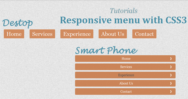
In this tutorial, we’ll create a responsive menu with new feature of css3 (media queries) to alter the design and layout of a website navigation menu to fit different screen sizes. It have design to change the layout from large screens to smaller screens support, making it responsive display.
In fact, professional web design not only focus on computer browser version but it should design for support mobile version to make visitor happy when it visit your website from smart phone. Responsive design is the best way to fix those problem, In this tutorial, we’ll focus on design of the user experience navigation menus to make it run better on mobile devices.
In this menu, it have design to response layout width small than 767px, it will display menu in smart phone version and layout width bigger than 767px, it will display menu on computer version.
The Markup
The HTML will be built up viewport meta tag to control layout on mobile browsers
A typical mobile-optimized site contains something like the following:
<head>
          <meta name="viewport" content="width=device-width, initial-scale=1, maximum-scale=1.0, user-scalable=no"/>
</head>
The menu will have the following structure:
<ul id="nav">
        <li class="current"><a href="#" title="Home" >Home</a></li>
  		<li><a href="https://www.freshdesignweb.com/" >Services</a></li>
  	    <li><a href="https://www.freshdesignweb.com/" >Experience</a></li>
  		<li><a href="https://www.freshdesignweb.com/" >About Us</a></li>
  		<li><a href="https://www.freshdesignweb.com/" >Contact</a></li>
      </ul>
The Cascading Style Sheets (CSS)
The navigation menu css will have the following code:
#nav { margin: 0; padding-top: 0.85em; width: auto; font-family:'Alegreya SC', Georgia, serif; font-size: 1.4em; }
#nav li { margin: 0 0 0.5em 0; display: block; float: left; clear: none; margin-right: 2.5%; background:#d18b5e; -moz-border-radius: 2px; -webkit-border-radius: 2px; border-radius: 2px; padding:5px 10px 5px 10px;}
#nav li:last-child { margin-right: 0; }
#nav a { display: block; color: #FFF; text-decoration:none; }
#nav a:hover { color: #484a50; border-bottom-color: #484a50; }
The media queries css will have the following code:
@media only screen and (max-width: 767px) {
	#nav .current{background:#666; -moz-border-radius: 5px; -webkit-border-radius: 5px; border-radius: 5px; background:none; }
	#nav { margin: 0 6% 0 0; padding: 0; }
	#nav li { margin: 0; display: block; float: left; width: 100%; clear: none; background:none; }
	#nav a { padding: 6px 0 8px; text-indent: 10px; color: #fff; background: rgba(194,100,40,0.75) url(images/bg_arrow_white.png) 96% 50% no-repeat; border-top: 1px solid rgb(194,100,40); -moz-border-radius: 5px; -webkit-border-radius: 5px; border-radius: 5px; }
	#nav a:hover { border-bottom: none; }
Now! We have a responsive navigation menu with CSS3. Check out the demo below, and feel free to download this example for future use. I hope you enjoyed this tutorial and find it useful!


Great Tutorial, can you explain how to add a submenu and make it respnsive
thanks
now understand the work of @media query. I am modifying one of my sub domain and want whole website responsive. And using 960.gs framework. But i think this trick also gona helpful for me 😉
This is a great post! I’ve met a lot of web designers who would still prefer to look online for a preference on how to design or regarding the codes to be used. Especially about CSS, where there are still a lot of things that should be learned.
Great one..