



CSS3 Hover Effects with Websymbols Tutorial
In tutorial it are going to show you new CSS hover effects using CSS transition properties with websymbols. It looks so much more interesting with creative design using circles transition style. It like CSS3 hover effects, so it would like to share some new creating special hover effects for you!
You like this post: CSS3 Hover Effects Style Restaurant Menus
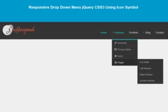
Also read: 54 Beautiful HTML CSS Button Style, 116 Useful CSS3 Tutorials Examples and Tricks for Designer, Free Responsive Drop Down Menu jQuery CSS3 Using Icon Symbol

The CSS3 properties are perform well with new modern browsers, nowadays CSS3 transition become popular in stead of jQuery animation. i hope that you also like CSS3 animation or HTML5 animation as well.
Please note: the result of this tutorial will only work as intended in browsers that support the respective CSS properties.
The Markup
The CSS3 hover effects with Web-symbols HTML will have the following structure:
 <ul class="ca-menu">
                    <li>
                        <a href="#">
                            <span class="ca-icon">A</span>
                            <div class="ca-content">
                                <h2 class="ca-main">Exceptional Service</h2>
                                <h3 class="ca-sub">Personalized to your needs</h3>
                            </div>
                        </a>
                    </li>
                    <li>
                        <a href="#">
                            <span class="ca-icon">I</span>
                            <div class="ca-content">
                                <h2 class="ca-main">Creative Storytelling</h2>
                                <h3 class="ca-sub">Advanced use of technology</h3>
                            </div>
                        </a>
                    </li>
                    <li>
                        <a href="#">
                            <span class="ca-icon">C</span>
                            <div class="ca-content">
                                <h2 class="ca-main">Infographical Education</h2>
                                <h3 class="ca-sub">Understanding visually</h3>
                            </div>
                        </a>
                    </li>
                    <li>
                        <a href="#">
                            <span class="ca-icon">S</span>
                            <div class="ca-content">
                                <h2 class="ca-main">Sophisticated Team</h2>
                                <h3 class="ca-sub">Professionals in action</h3>
                            </div>
                        </a>
                    </li>
    </ul>
The Cascading Style Sheets (CSS) will have the following structure:
On high lights color line 98 is css3 properties to define circle hover effects
font-face {
    font-family: 'WebSymbolsRegular';
    src: url('images/websymbols/websymbols-regular-webfont.eot');
    src: url('images/websymbols/websymbols-regular-webfont.eot?#iefix') format('embedded-opentype'),
         url('images/websymbols/websymbols-regular-webfont.woff') format('woff'),
         url('images/websymbols/websymbols-regular-webfont.ttf') format('truetype'),
         url('images/websymbols/websymbols-regular-webfont.svg#WebSymbolsRegular') format('svg');
    font-weight: normal;
    font-style: normal;
}
.ca-menu{
    padding:0;
    margin:20px auto;
    width: 1020px;
	font-family: 'Dosis', sans-serif;
}
.ca-menu li{
    width: 230px;
    height: 230px;
    border: 10px solid #f6f6f6;
    overflow: hidden;
    position: relative;
    float:left;
    background: #fff;
    margin-right: 4px;
    -webkit-box-shadow: 1px 1px 2px rgba(0,0,0,0.2);
    -moz-box-shadow: 1px 1px 2px rgba(0,0,0,0.2);
    box-shadow: 1px 1px 2px rgba(0,0,0,0.2);
    -webkit-border-radius: 125px;
    -moz-border-radius: 125px;
    border-radius: 125px;
    -webkit-transition: all 400ms linear;
    -moz-transition: all 400ms linear;
    -o-transition: all 400ms linear;
    -ms-transition: all 400ms linear;
    transition: all 400ms linear;
}
.ca-menu li:last-child{
    margin-right: 0px;
}
.ca-menu li a{
    text-align: left;
    width: 100%;
    height: 100%;
    display: block;
    color: #333;
    position: relative;
   -moz-box-shadow:0px 0px 3px #000000;
   -webkit-box-shadow:0px 0px 3px #000000;
   box-shadow:0px 0px 3px #000000;

}
.ca-icon{
    font-family: 'WebSymbolsRegular', cursive;
    font-size: 40px;
    color: #f6f6f6;;
    line-height: 60px;
    position: absolute;
    width: 100%;
    height: 60px;
    left: 0px;
    top: 30px;
    text-align: center;
    -webkit-transition: all 400ms linear;
    -moz-transition: all 400ms linear;
    -o-transition: all 400ms linear;
    -ms-transition: all 400ms linear;
    transition: all 400ms linear;
}
.ca-main{
    font-size: 24px;
    position: absolute;
    top: 110px;
    height: 80px;
    width: 170px;
    left: 50%;
    margin-left: -85px;
    opacity: 0.8;
    text-align: center;
}
.ca-sub{
    text-align:center;
    color: #000;
    font-size: 26px;
    position: absolute;
    height: 80px;
    width: 170px;
    left: 50%;
    margin-left: -85px;
    top: 110px;
    opacity: 0;
    -webkit-transition: all 400ms linear;
    -moz-transition: all 400ms linear;
    -o-transition: all 400ms linear;
    -ms-transition: all 400ms linear;
    transition: all 400ms linear;
}
.ca-menu li:hover{
    background: #f7f7f7;
    border-color: #fff;
    -webkit-transform: rotate(360deg);
    -moz-transform: rotate(360deg);
    -o-transform: rotate(360deg);
    -ms-transform: rotate(360deg);
    transform: rotate(360deg);
    box-shadow: 0 45px 60px -50px #000000;
}
.ca-menu li:hover .ca-icon{
    color: #555;
    font-size: 60px;
}
.ca-menu li:hover .ca-main{
    display: none;
}
.ca-menu li:hover .ca-sub{
    opacity: 0.8;
}
Now! It have a CSS3 hover effects with Web-symbols. Check out the demo below, and feel free to download this example for future use. I hope you enjoyed this tutorial and find it useful!







This is look cool, will try it at home 😀 Thanks for sharing
amazing css, thank you for tutorial.