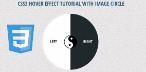
CSS3 Hover Effect Tutorial with Image Circle
In tutorial it will show you new CSS3 hover effects using image circle animation transform to enhance your web design interface . It looks so much more interesting with creative design using circles image transition style. It always like CSS3 animation effects more than jquery of flash animation, so it would like to share some new creating special CSS3 hover effects for you!
You like this post:
Also read: 54 Beautiful HTML CSS Button Style, 33 Best HTML5 and CSS3 3D Demo Examples, 116 Useful CSS3 Tutorials Examples and Tricks for Designer

Please note that this will only work properly in modern browsers that support the CSS3 properties in use.
Let’s start with the HTML
The Markup
The CSS3 Hover Effect Tutorial with Image Circle HTML will have the following structure:
<div id="skin">
    	<p class="icon"></p>
    	<a href="https://www.freshdesignweb.com" class="fdw_left">Left</a>
        <a href="https://www.freshdesignweb.com" class="fdw_right">Right</a>
</div>
The Cascading Style Sheets (CSS) will have the following structure:
#skin {
	position:relative;
	border-radius:50%;
	-moz-border-radius:50%;
	-webkit-border-radius:50%;
	border:10px solid rgba(255,255,255,.10);
	width:284px;
	height:284px;
	overflow:hidden;
	-webkit-transition: all .3s ease;
	-moz-transition: all .3s  ease;
	-o-transition: all .3s  ease;
	-ms-transition: all .3s  ease;
	transition: all .3s ease;
}
.fdw_left,
.fdw_right {
	float:left;
	width:50%;
	height:100%;
	margin:0;
	text-align:center;
	line-height:280px;
	text-decoration:none;
}
.fdw_right {
	border-radius:0 142px 142px 0;
	-moz-border-radius:0 142px 142px 0;
	-webkit-border-radius:0 142px 142px 0;
}
.fdw_left {
	background-color:#fff;
	border-radius:142px 0 0 142px;
	-moz-border-radius:142px 0 0 142px;
	-webkit-border-radius:142px 0 0 142px;
	color:#1e2a2a;
	text-indent:-30px;
}
.fdw_right {
	background-color:#1e2a2a;
	color:#FFFFFF;
	text-indent:35px;
}
#skin .icon {
	width:71px;
	height:77px;
	position:absolute;
	top:50%;
	left:50%;
	margin:-39px auto 0 -35px;
	background: url(images/icon.png) top center no-repeat;
	-webkit-transition: all .3s ease-in-out;
	-moz-transition: all .3s  ease-in-out;
	-o-transition: all .3s  ease-in-out;
	-ms-transition: all .3s  ease-in-out;
	transition: all .3s ease-in-out;
}
#skin a {
	font-weight:700;
	font-family: 'Open Sans Condensed','Arial Narrow', Arial, sans-serif;
	text-decoration:none;
	text-transform:uppercase;
	font-size:20px;
	-webkit-transition: background-color .3s;
	-moz-transition: background-color .3s;
	-o-transition: background-color .3s;
	-ms-transition: background-color .3s;
	transition: background-color .3s;
}
#skin a:hover {
	background-color:#00b68f;
	color:#FFF;
	}
#skin:hover {
	border:10px solid rgba(255,255,255,.5);
	}
#skin:hover .icon {
	transform: rotate(180deg);
	-ms-transform: rotate(180deg); /* IE 9 */
	-webkit-transform: rotate(180deg); /* Safari and Chrome */
	-webkit-transition: all .3s ease-in-out;
	-moz-transition: all .3s  ease-in-out;
	-o-transition: all .3s  ease-in-out;
	-ms-transition: all .3s  ease-in-out;
	transition: all .3s ease-in-out;
	}
Now! It have a CSS3 Hover Effect with Image Circle. Check out the demo below, and feel free to download this example for future use. I hope you enjoyed this tutorial and find it useful!